
 By
·
6 minute read
By
·
6 minute read
You've installed the signs. You've painted the floor lines. You've even added a few more warning placards after the last near-miss. And yet, your team still walks straight past them like they are not there.
We understand the frustration. You're doing everything the safety consultant recommended, but sign blindness keeps undermining your efforts. Workers aren't ignoring the warnings deliberately - their brains are filtering them out automatically.
In this article, we'll show you how warehouse design, visual management systems, and strategic safety solutions can prevent accidents more effectively than any number of additional signs ever could.
Contents
- Why Do We Default to Adding More Signs?
- What Does the Hierarchy of Controls Tell Us About Signage?
- How Can Facility Design Eliminate the Need for Warning Signs?
- Can Visual Systems Replace Static Signage?
- What Role Do Physical Barriers Play in Reducing Sign Reliance?
- How Do You Know If Your Current Approach Is Working?
Why Do We Default to Adding More Signs?
When an accident happens or an audit highlights a risk, the immediate response is often to put up another sign. It's quick, it's cheap, and it feels like you're taking action.
But here's what happens. That new sign works fine for the first few weeks. Everyone notices it. Then it becomes part of the scenery. Within a few months, it's as invisible as the wall it's mounted on.
The HSE's guidance on the Health and Safety (Safety Signs and Signals) Regulations 1996 is clear on this point. Signs should only be used "where, despite putting in place all other relevant measures, a significant risk to the health and safety of employees and others remains."
In other words, if your primary safety strategy involves sticking up more signs, you're starting at the wrong end of the problem.
What Does the Hierarchy of Controls Tell Us About Signage?
.png?width=564&height=399&name=Your%20paragraph%20text%20(3).png)
The hierarchy of controls ranks safety measures from most effective to least effective. At the top sits elimination - removing the hazard entirely. At the bottom sits PPE and administrative controls, which include signage.
Signs are the weakest form of control because they rely entirely on human behaviour. They assume people will see the sign, read it, understand it, remember it, and act on it correctly. That's a lot of assumptions riding on a piece of metal or plastic.
Design-based controls sit much higher up the hierarchy. When you design a facility so that pedestrians and forklifts never share the same space, you've eliminated the collision risk entirely. No sign required. No reliance on perfect behaviour.
This doesn't mean signs have no place. They're essential for communicating information that can't be designed out. But they work best as reinforcement, not as your primary protection.
How Can Facility Design Eliminate the Need for Warning Signs?
The most effective warehouses don't fight human behaviour with more warnings. They design their layouts so that the safe route is also the natural route.
Segregate pedestrian and vehicle routes entirely
Under the Workplace (Health, Safety and Welfare) Regulations 1992, workplaces must be organised to ensure that vehicles and pedestrians can move around safely. Complete segregation means you need far fewer "Caution: FLT Traffic" signs because pedestrians aren't crossing vehicle routes in the first place.
Look at your warehouse from a pedestrian's perspective. If the shortest path between the staff room and their workstation cuts across a forklift route, they'll take that shortcut no matter how many signs you put up. Redesign the layout so the designated walkway is actually the quickest route, and compliance becomes automatic.
Position barriers where workflow creates risk
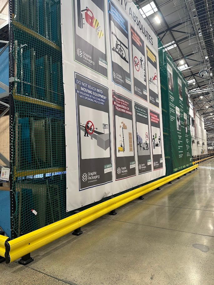
Painted floor lines depend on perfect behaviour. Physical segregation using polymer barriers protects people when behaviour isn't perfect - when a forklift driver misjudges a turn, when a new employee doesn't know the safe route yet, when someone's rushing to meet a deadline.
The crucial bit: barriers positioned based on workflow patterns prevent conflicts rather than just marking where conflicts might happen. Watch where people actually walk, not where your floor plan suggests they should walk. Install protection at the pinch points where pedestrian desire lines cross vehicle paths.
Create natural visual hierarchy through contrast and lighting
Your facility's visual environment either helps workers distinguish important information from background noise, or it buries safety messages in visual clutter.
High-contrast floor markings stand out better than faded paint. Well-lit walkways naturally guide people along safe routes. Clear sightlines at intersections give workers time to react before entering a hazard zone.
These design features communicate "this is where you walk" without requiring a single sign. The environment itself becomes the instruction.
Can Visual Systems Replace Static Signage?
Static signs fade into the background because they never change. Dynamic visual systems maintain attention because they respond to actual risk in real-time.
LED Projected Floor Markings Cut Through Habituation
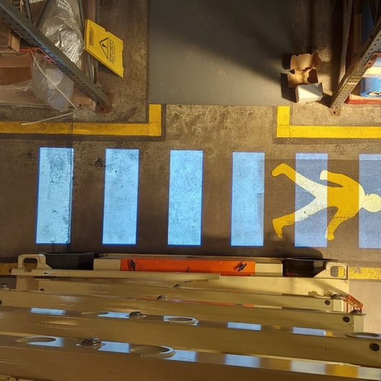
LED projected floor markings work differently from traditional signage. Instead of mounting a warning on a wall and hoping people notice it, these systems cast bright, high-contrast guidance directly onto the floor where workers are already looking.
Light naturally draws the eye. A projected zebra crossing appears exactly where pedestrians need to cross a forklift route - not 10 metres away on a wall they've learned to ignore.
Some systems activate on motion, illuminating only when a pedestrian or vehicle approaches. That element of change prevents the brain from filtering out the warning. After five years of walking past the same static sign, your brain knows it's there and stops processing it. A projection that appears as you approach can't be filtered out the same way.
Visual Management Replaces Cluttered Signage with Organised Information
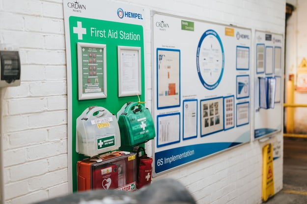
Traditional signage tells you the rules in isolation. Professional visual management systems communicate status, expectations, and processes in one organised, easy-to-scan location.
Instead of having 15 different A4 notices about loading bay procedures, shift patterns, KPIs, and daily targets scattered across walls, you have one well-designed visual management board that consolidates the information workers actually need.
The Crown Paints case demonstrates this shift perfectly. Before working with Clarity, departments created their own visual management that "looked poor and people didn't buy into it." After implementing professional KPI boards, shadow boards, and colour-coded systems, engagement transformed. Not because the information changed, but because the presentation did.
Read the full case study here → Crown Paints Case Study
Shadow Boards Communicate Instantly Without Words

A shadow board showing tool locations does more than organise equipment. It creates an instant visual check: if the shadow is showing, the tool is missing. No sign needed saying "Return tools after use." The empty space communicates the problem.
The same principle applies to cleaning stations, PPE storage, and equipment management. Colour-coded shadow boards show at a glance what's where and what's missing. Workers respond to the visual gap, not to written instructions.
KPI Boards Provide Context That Static Signs Can't
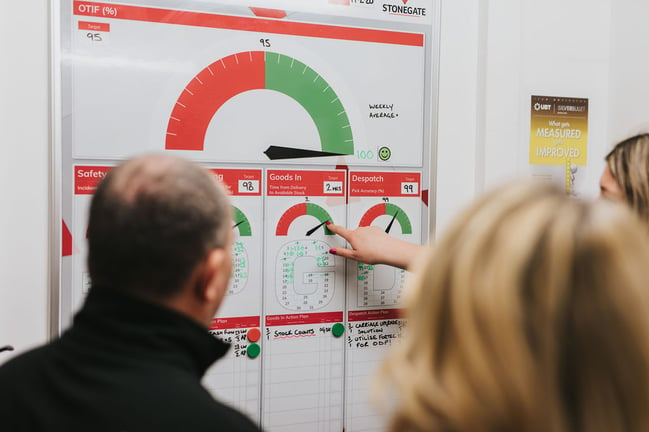
A sign saying "Maintain Safe Working Distance" is abstract. A KPI board showing today's near-miss count, trending down after implementing new procedures, creates engagement. People see the connection between behaviour and outcomes.
Visual management boards showing safety metrics, delivery performance, quality targets, and team goals replace dozens of individual procedure signs while actually increasing engagement and understanding.
Colour-Coding Reduces Cognitive Load
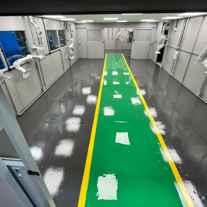
When every safety message requires reading and interpretation, workers experience decision fatigue. Colour-coding simplifies this. Yellow floor markings always mean caution zones. Green always means pedestrian-only areas. Red always means vehicle-only.
After a few weeks, workers navigate by colour without conscious thought. The system guides behaviour without requiring constant attention to written instructions.
What Role Do Physical Barriers Play in Reducing Sign Reliance?
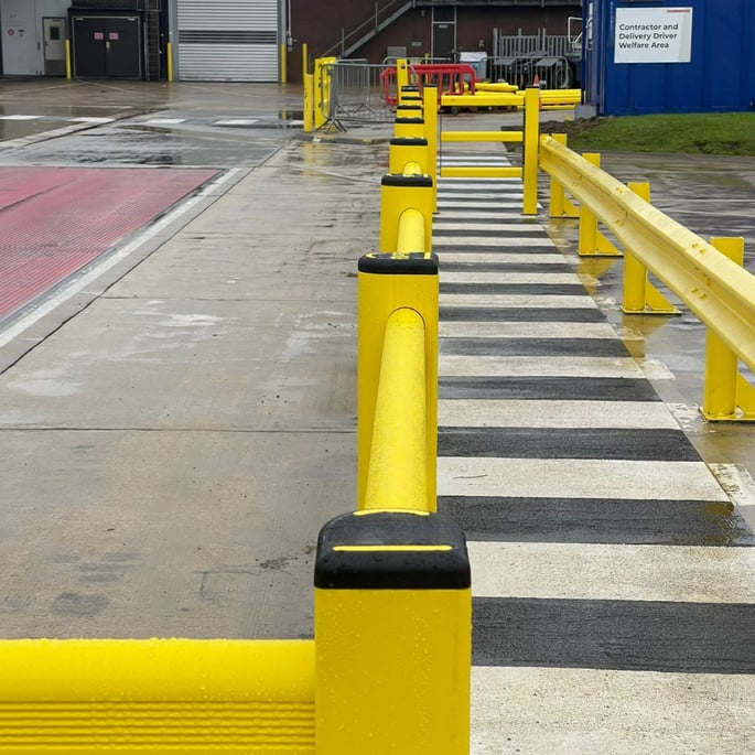
Physical barriers don't just protect - they communicate. A barrier's presence tells workers "you can't go here" more clearly than any sign ever could.
Barriers Define Zones Without Written Instructions
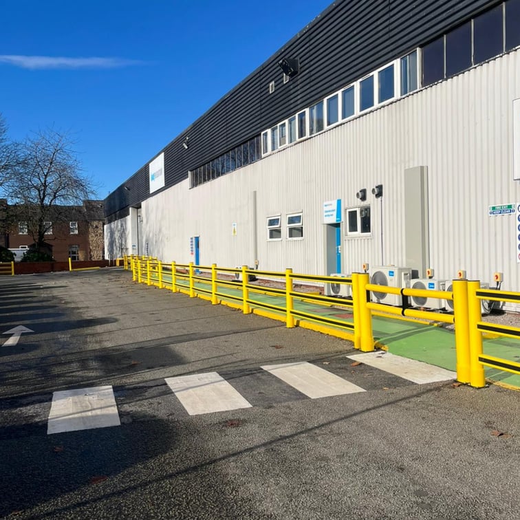
When you install pedestrian barriers along a walkway, you've created a protected route that needs no explanation. The barrier itself communicates the boundary. Workers stay inside the protected zone not because they've read a sign, but because the physical environment guides them there.
Modular polymer barrier systems offer particular advantages for evolving facilities. Unlike welded steel barriers that become permanent fixtures, polymer systems reposition when your layout changes. Your safety infrastructure adapts with your operations rather than becoming outdated.
Strategic Barrier Placement Prevents the Conflicts that Require Signage
Many warehouses have signs warning "Watch for FLTs" at locations where forklifts and pedestrians cross paths. A better solution: install barriers that prevent those paths from crossing in the first place.
Barriers positioned at blind corners, loading bay entrances, and high-traffic intersections eliminate the scenarios that signs try to warn about. You're controlling the hazard rather than just communicating about it.
Combining Barriers with LED Projections Creates Complete Protection
The most effective systems layer multiple controls. Physical barriers provide the protection. LED projections add high-visibility guidance. Visual management boards communicate procedures and performance. Together, they create an environment where unsafe behaviour becomes physically difficult rather than just discouraged.
In narrow warehouse aisles where space is tight, polymer barriers offer a slimmer profile than steel whilst maintaining PAS13-rated impact resistance. This becomes critical in congested areas where you need safety without sacrificing operational space.
How Do You Know If Your Current Approach Is Working?

If you're still adding signs to solve safety problems, there are warning signs worth watching.
Workers Are Creating Their Own Routes
When pedestrians cut across areas they're not supposed to enter, your layout is fighting against natural desire lines. No amount of signage will overcome a design that forces people to walk 50 metres out of their way.
Near-misses Keep Happening in the Same Locations
Repeated incidents at specific pinch points indicate a design problem, not a compliance problem. That blind corner needs better sight lines or complete segregation, not another warning sign.
Your Signage Looks Homemade and Inconsistent
Ad-hoc A4 printouts stuck on walls with sellotape get ignored. Professional visual management systems with consistent branding and clear information hierarchy command attention.
Auditors Are Flagging Visibility Issues
If inspectors note that your signage is difficult to see, poorly maintained, or overwhelmed by visual clutter, the underlying issue is usually too many signs in the first place. Reducing the total number whilst improving the design and maintenance of essential signs often delivers better results than adding more.
New Employees Struggle To Navigate Safely
When new workers can't figure out where to walk despite all your signage, the environment itself isn't communicating clearly. Good design should be largely self-explanatory.
Design Safety Into Your Facility
Sign blindness isn't a problem you solve by adding more signs. It's a problem you solve by designing an environment where the safe behaviours are also the natural behaviours.
The best warehouses combine complete segregation where possible, physical barriers where segregation isn't practical, LED projected systems that maintain attention, professional visual management that consolidates information, and strategic signage that reinforces rather than replaces good design.
If your current safety strategy depends heavily on workers noticing, reading, and acting on static signs, it might be time for a different approach.
Book a free site assessment, and we'll help you identify design improvements that reduce your reliance on signage whilst improving safety outcomes.


%20(8).jpg)